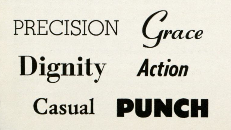
 Today, Word, Photoshop, and other programs and websites offer hundreds, if not thousands, of letter designs and type at different fonts. Now, "font" is the word we use to describe the elaborate or simple text we use when composing a text note on various computer software. In typography however, font is the sizing and other stylistic choices used to make each text type look distinct. Though today it is easy to select a type on our software, there have been many who have and continue to work with type. Special Collections and Archives has lot of books on the topic of typography only a few of which are highlighted here.
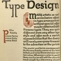
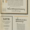
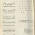
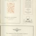
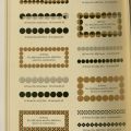
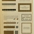
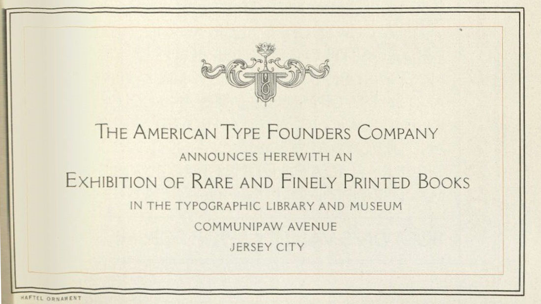
The Specimen Book and Catalogue: Dedicated to the Typographic Art, published in 1923 by the American Type Founders Company, introduces the book with lots of information about the types that they created and hold at the company. The book goes into detail about the history, the types of machines that were used before their modern machines of the time, the intricate nature of each type that was created, and the expertise one needs to be part of the type business. An interesting thing to note is that, very similar to graphic designers now, type was used and designed to entice and persuade, depending on a client’s needs. This is a very large book with details of all the type lettering and designs they offered.
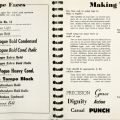
In the newspaper business, Type Book and Advertising Production Guide was used by clients as a step by step guide on how to publish advertisements in the Des Moines Register and Tribune. As stated above, advertisements are meant to persuade and this book used that idea to help their clients. This book lists types that the Register and Tribune offer, sizing, and other characteristics that those working on an advertisement would need to know. The guide walks clients through how they should submit a request, type, sizing, images and their sizing, price and other pertinent information needed to publish an advertisement.
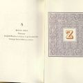
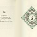
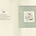
 In Don't Nobody Care About Zeds, Hoffman describes a time when he was at a type shop while browsing and someone said, "Don’t nobody care about zeds…" This compelled Hoffman to show that they indeed were important. Hoffman listed friends, colleagues, and the Zamorano club, all of who clearly needed the letter Z to be identified. In this book he wanted to show that there are many variations in Z type that were created, but also show the intricate and beautiful qualities about them. Each Zed in this book is listed by title and maker.
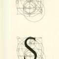
From a professional standpoint type has been important, for others type has been important as identifying markers, and in math letter type is also fascinating. In the book A Constructed Roman Alphabet, published in 1982, is a Geometric analysis of the Greek and Roman capitals of the Arabic numerals. This book conducts a detailed analysis of each Roman and Greek letter and numbers through the use of geometry. In the example below, a step-by-step description of how the letter "S" can be measured and its intricacies. Though we may see it as a simple letter, geometrically it is a complex combination of lines and circles and creates a balanced and beautiful styled letter "S."


